Creating responsive websites have always remained a challenge for many even I faced similar difficulties in the beginning. Recently, our team came across a situation where we had to design a responsive and beautiful website in Drupal 8 for a media and publishing firm. In order to create such an amazing site, we came up with an idea to use Foundation Framework and yes! it worked.
I have written this blog to help anyone having difficulty in understanding the Foundation framework to develop responsive websites as it is a rising market demand. My idea is that this article will be a "living laboratory" to help you in understanding Foundation from the scratch. The post comprises an intro of Foundation, its features, comparison with Bootstrap, getting started with Foundation. At the end, you can also check out the list of prominent brands using this framework. You may also like to check out our previous blog “An overview of Foundation: A Frontend Framework for Responsive Websites.”
First things first, an Introduction
Foundation is an open source front-end framework that helps in designing responsive websites, apps, and emails. It provides a responsive grid, HTML and CSS UI components, templates, and code snippets, forms, buttons, navigation, other interface components and optional JavaScript extensions to build a responsive site.
Features
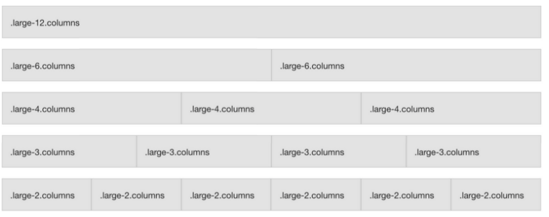
Foundation has been designed for and tested on various browsers and gadgets. The open source framework is a mobile-first that give developers best practices for rapid development. Other features of Foundation - it is consist of 12 column grid system, supports stylized CSS components and RTL (right to left) direction format and compatible with several browsers.
12-Column Grid System:
Credit: Codementor
Media Queries:
Foundation has three core Breakpoints.
Small Any Screen up to 639 px.
/* Small only */
@media screen and (max-width: 39.9375em) {...}
Medium Any Screen from 640 px or Wider.
/* Medium only */
@media screen and (min-width: 40em) and (max-width: 63.9375em) {...}
Large Any Screen from 1024 px or Wider.
/* Large and up */
@media screen and (min-width: 64em) {...}
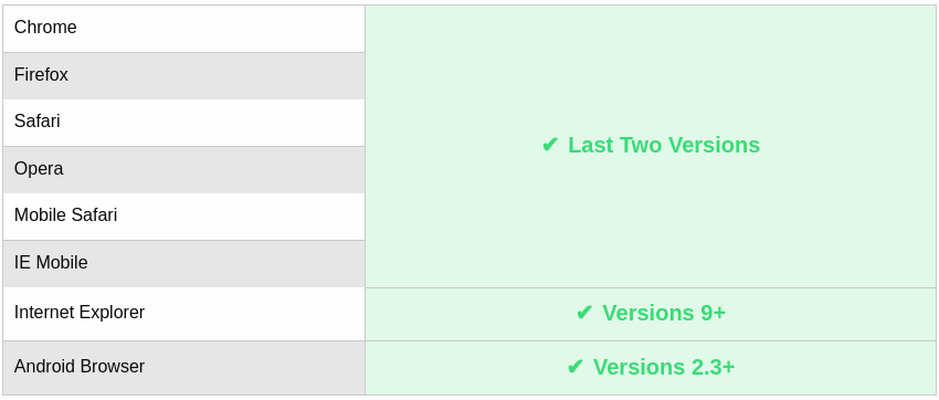
Compatibility:
In addition to Android browsers, Foundation also supports all the latest versions of Chrome, Firefox, Safari, Opera and Internet Explorer.
Credit: Codementor
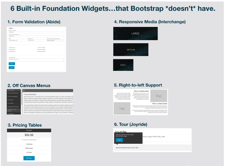
Widgets:
Below are some widgets & JavaScript features developed in Foundation that Bootstrap does not support.
Credit: Codementor
Let’s check out some of the differences between Bootstrap and Foundation:
Well, there are many differences and similarities between Bootstrap and Foundation. The main similarity is that they are both great front-end frameworks that can be used to build an awesome application and website.
Comparison
Bootstrap Classes | Foundation Classes |
| col-xs-* | small-* |
| col-sm-* | medium-* |
| col-md-* | large-* |
| col-lg-* | |
CSS3 Preprocessors | CSS3 Preprocessors |
| LESS | SASS(SCSS) |
| SASS(SCSS) | |
RTL (right to left) Format | RTL (right to left) Format |
| Doesn’t support RTL format | Supports RTL format |
Note: Bootstrap supports both LESS AND SASS (SCSS) Preprocessors, but Foundation supports only SASS (SCSS). Here * represents a number, valid up to 12.
Getting Started with Foundation:
Well, there are many ways to install Foundation, but here I will be discussing two ways: First by CSS and second by using the terminal.
If you are just getting started with CSS then you can download Foundation. Customize it and choose the features you want to have on your website.
While getting started, you can find a couple of options like Downloading complete Foundation and Download customized Foundation. Select as per your requirement.
After downloading Foundation, your folder structure would look like this. See the screenshot below.
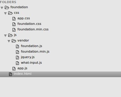
- app.css is the custom css file which we can add on our own css
- foundation.css is the default css implemented by Foundation
- foundation.min.css is the minified css
- jquery.js is required to provide the Responsive functionality to the website. You just need to have JQuery version 1.10 or higher on your page before the foundation.js library.
- what-input.js is used to track the current input method.
- foundation.js is used for utilizing core functionality.
- app.js is the custom js file which we can add our js.
- You need to specify all the above files in your HTML file.
- You can also install Foundation CLI by using Terminal
- sudo npm install --global foundation-cli
- Once you've installed the CLI, use the new command to start making a new project:
- foundation new
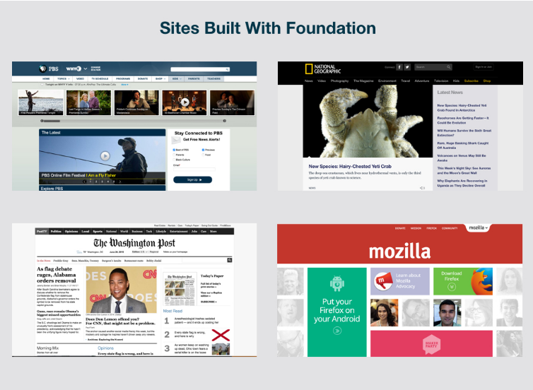
See the screenshot below for an example of Websites designed with Foundation Framework.
Credit: Codementor
Prominent brands using Foundation Framework:
- PBS: Public Broadcasting Service
- National Geographic
- Washington Post
- Mozilla
- Cambridge University Press
- Official HTC Store (UK)
- National Geographic Education
- Burger Revolution
Using Foundation Framework, we can build responsive websites that will be both unique and beautiful. In this blog, we have explored the basics of Foundation Framework, its overview, features, companies using this framework to design responsive sites as well as how to install customized Foundation using terminal and CSS. This blog is intended to give you a brief intro of the framework and its comparison with Bootstrap.
Foundation Framework helps in reducing the CSS and JS, so we recommend you to try multiple front-end frameworks to find out what works better for your current project. Based on your comments and suggestions, I plan to add to it, creating additional value. Or maybe it is perfect as-is!
