
Mobile devices are being used more than desktops for browsing the web. Mobile web browsing has been increasing since 2009 and it has been a steep ride since October 2016. Last year it crossed over desktop usage with the global mobile and tablet browsing accounting for 51.3% for mobile and tablet against 48.7% of desktops.
Google has been favoring mobile friendly websites for it’s mobile search results and the global trend has been following suit. With more and more people opting for mobile browsing, accessibility covers web pages and web applications, including content used on mobile devices and web browsers.
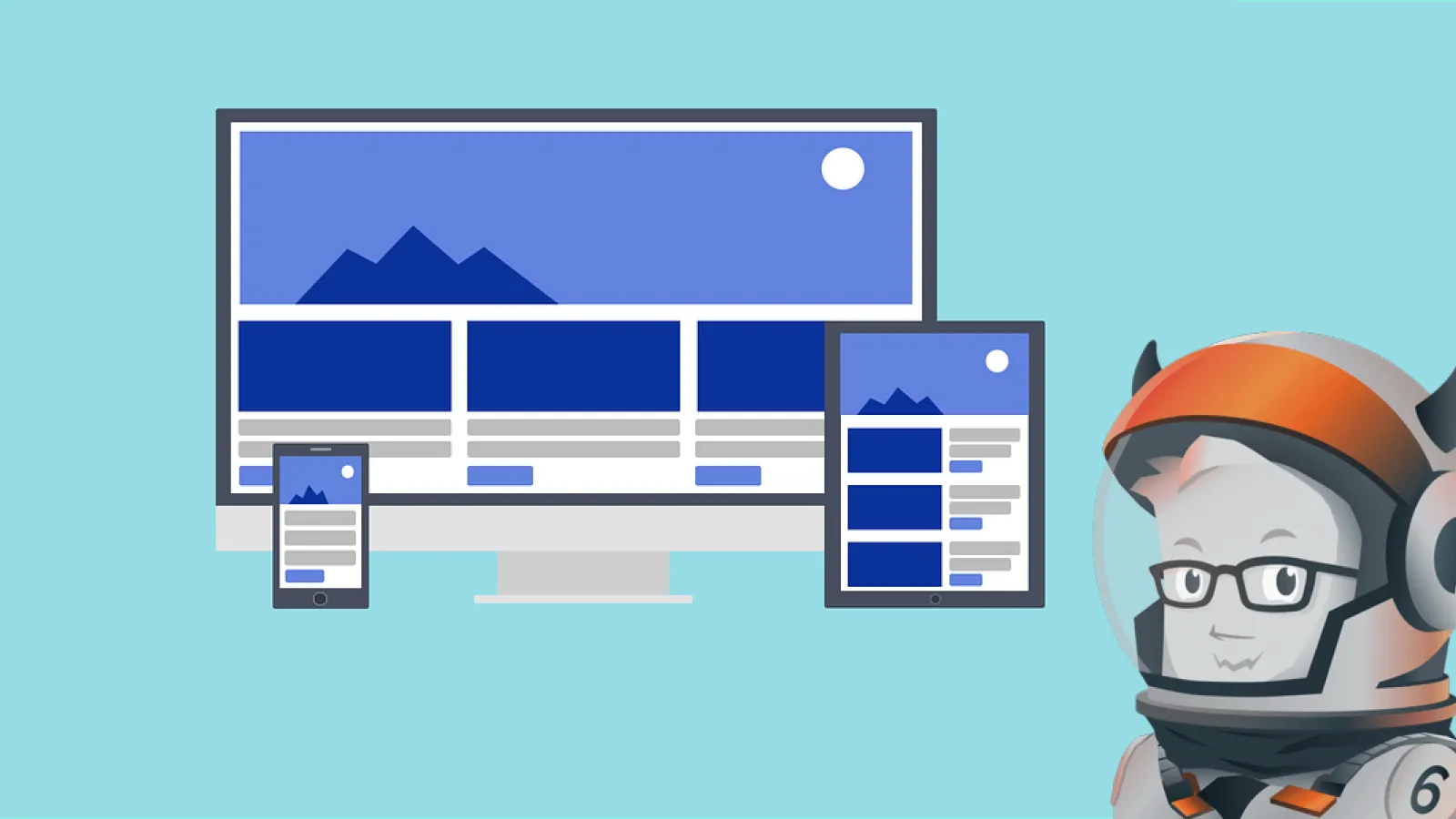
Clients want a mobile version of the website and that makes sense with phones, tablets and everything it is the need of the hour. But the design and development of websites will no more have the need to be built specifically for a device type. UX has been upgraded with easy layouts and smart CSS with responsive web design framework, it is simple, fast and adaptive, it responds to the user’s behavior and environment.
What is a Framework?
“A software framework is an abstraction in which a common code providing generic functionality can be selectively overridden or specialized by user code providing specific functionality. Frameworks are a special case of software libraries in that they are reusable abstractions of code wrapped in a well-defined Application programming interface (API), yet they contain some key distinguishing features that separate them from normal libraries” from Wiki. Most websites have a similar structure and frameworks use that so the code can be reused.
Frameworks are Frontend and Backend and the difference is being set by whether it is used for the user interface or the application. Front end framework defines the user experience of the website, the look, and feel.
Front-end Frameworks
Frontend Frameworks have codified package made up of a structure of files and folders for the presentation layer of websites. There are a bunch of front end tools to choose from depending on the flexibility and features needed.
One of the most popular frameworks are Foundation, which is a Frontend Framework, I came to use foundation framework lately for and found it to be feature responsive and mobile first framework. Foundation eliminates the need to use pixels and uses REMS. With pixels, it makes it difficult to state the height, width and other attributes for devices. REM scales with the device.
Below given is a presentation on Foundation, what it is, how it is used and who uses it.