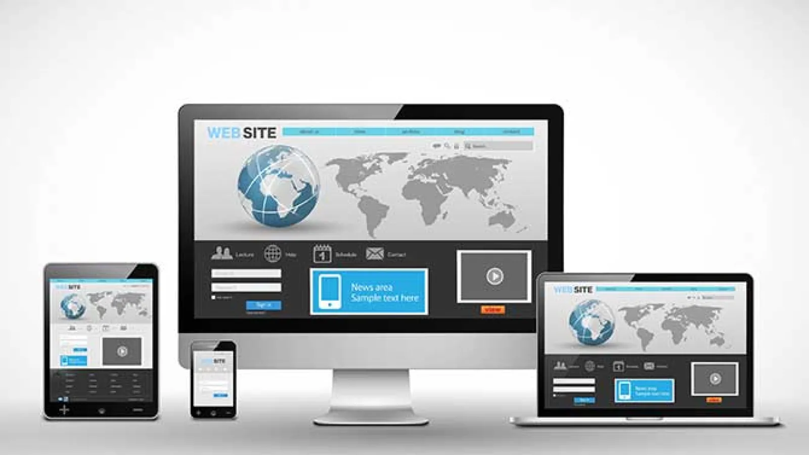

A responsive web design has emerged as the mainstay of enterprise level web development as organizations strive to make their presence felt by adapting to the rapidly evolving digital landscape. With smartphones and phablets redefining the internet browsing trends, a responsive design is an intelligent solution to optimize the viewing experience of your website visitors. The idea of a responsive website centers around the premise of the site being accessible from a plethora of devices and mobile platforms with a single URL. Drupal is one of the many Content Management Systems providing this responsive adaptability with the help of various modules, some of which we have discussed here.
# Adaptive Images
This module provides images sourced from the Fields that readily adapt to the screen size of the device they are being viewed on. An easy to implement module that facilitates adaptive imaging, Adaptive Images integrates seamlessly with the built-in image styles to add the “adaptive” effect to the styles.
# Client Side Adaptive Image
Another module based on the adaptive imaging concept, this module lets you display the responsive images from a field formatter. An easy to setup module, it has no dependencies and neither does it require any modifications in the .htacess file. As the option of selecting an image rests with the client’s side, the module has been aptly named “Client-side adaptive image”
# Fences
A convenient tool for specifying an HTML element for each field resulting the Fences module helps you create custom wrappers for fields. It eliminates the need for continuous reconfiguration of the same HTML element every time the field is displayed. This module provides a leaner markup when compared to the Drupal 7 Core while avoiding the extraneous classes.
# Breakpoints
The implementation of the Breakpoints module helps in enabling your theme so that the breakpoints are exposed to the other modules. It standardizes and keeps track of the breakpoints in height, width and resolution for different devices. The Breakpoints Module has a dependency in the Chaos Tool Suite while it works effectively along with the Picture and Breakpoints Panel modules.
# Picture
The Picture module is meant for managing images on a website with a responsive design. Along with optimizing display for both print and screen, this module prevents bandwith wastage while delivering alternate image sources based on the device being used. This module has two dependencies: the Breakpoints module and the other being the Image Styles module which is a part of Drupal Core. So if you are looking to install the Picture module, make sure that you have pre-installed and enabled Breakpoints along with the Image Styles modules.
# Fitvids
This module is meant to help you embed videos from sites like Youtube, Vimeo, Blip.tv, Kickstarter and Dailymotion. This j-Query plug-in helps you in resizing the videos based on the aspect ratio, making the videos fluid and responsive. A responsive theme like Zen, Omega or Adaptive theme along with the Libraries API, are the basic requirements that need to taken care of before enabling Fitvids.
# Flex Slider
The Flex Slider module is meant to integrate the Flex Slider library with a Drupal based website to create slideshows that can be resized to adapt to a particular browser window or mobile device. The module brings in features like touch enabled navigation, the usage of multiple sliders on a single page and configurable slide animations. It integrates with both Fields(flexslider_fields) and Views(flexslider_views).
The fluidity of a responsive web design helps in integrating a website with the advanced web browsing features in different mobile devices to create an optimized user experience. A smart alternative for a separate website for mobile devices, a responsive Drupal website lets you focus on crafting an effective SEO Digital marketing strategy that results in better social engagement and ROI. So it is high time that you considered a responsive web design if you are still stuck with administering an unresponsive website.
We at Valuebound understand your unique business needs to come up with custom enterprise level web solutions. For further information on our service offerings, please Contact Us.